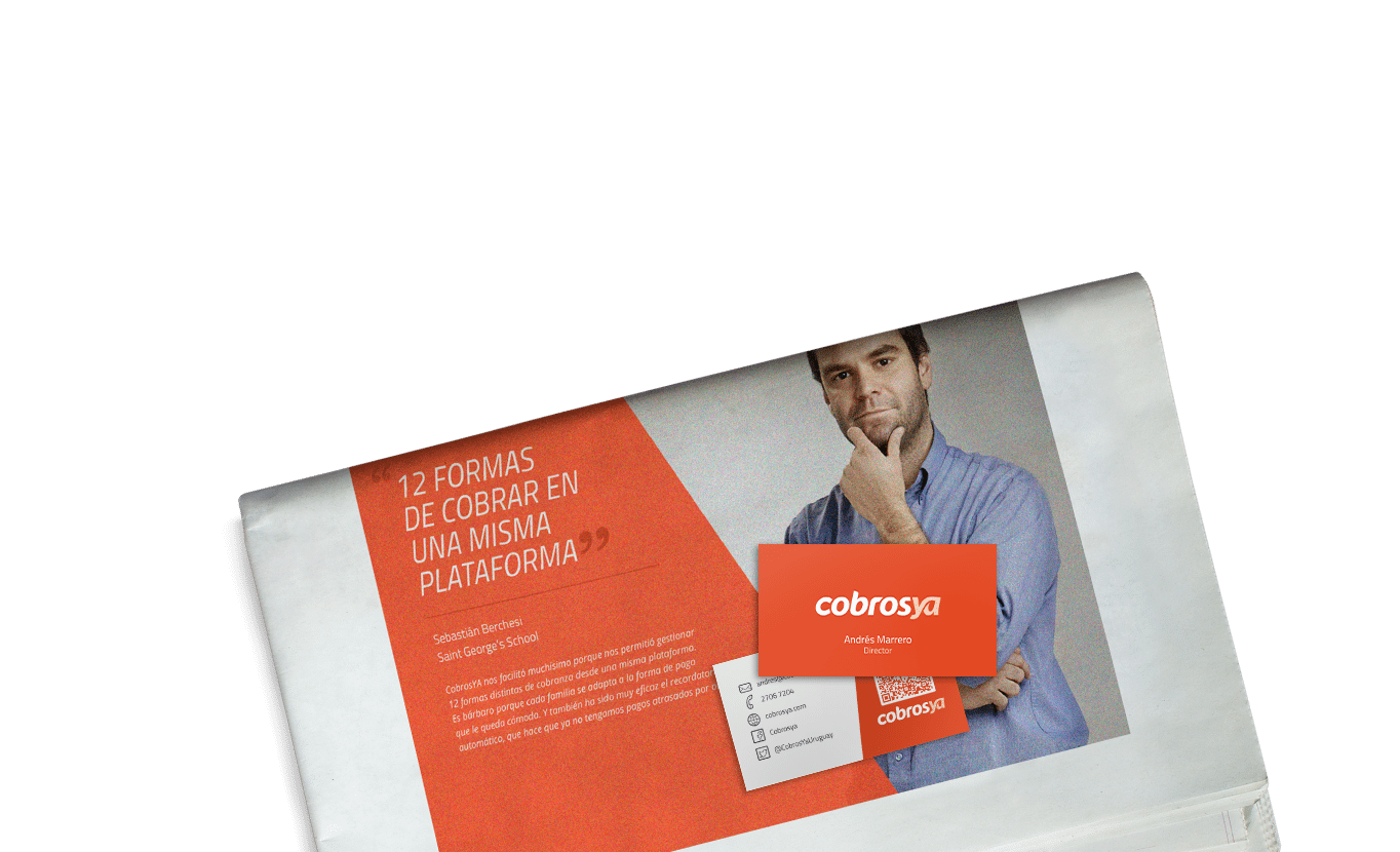
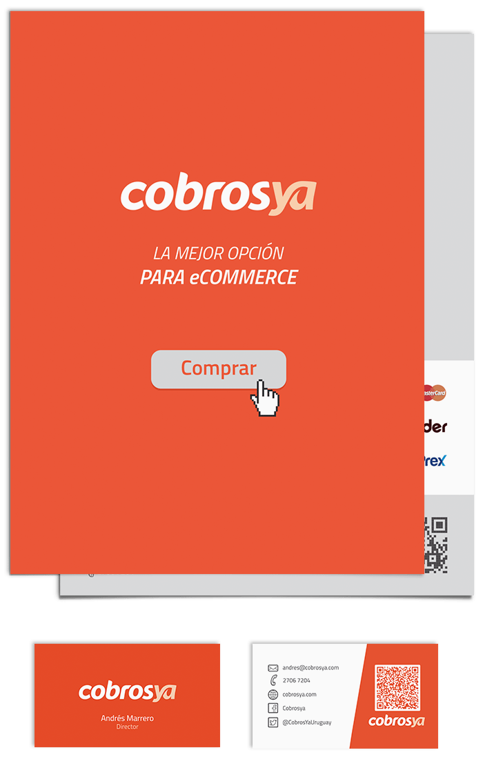
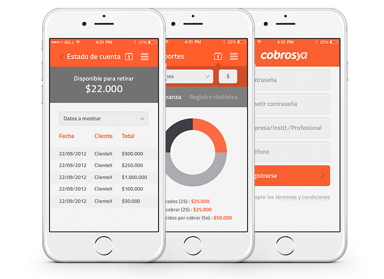
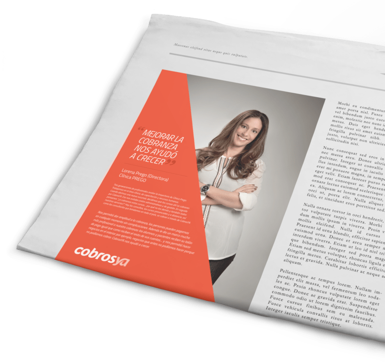
Along with Cardinal agency, we've redesign Cobros Ya's branding to come up with a product closer to the apps current design standards. It was adopted to a simplier, flat and full color design, getting rid of lighting effects, line strokes, boring color palletes and dropped shadows of its earlier visual identity.
In this redesign we decided to choose a brighter color palette with greater strength and contrast, where the orange has the leading role. The diagonals marks dynamism, the iconography helps the user experience (UX) and the photography generates the necessary visual impact for advertising pieces.
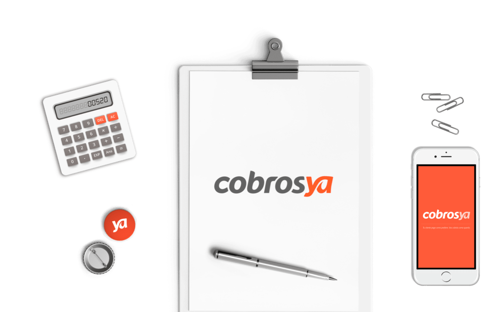
Finally, the most important piece of all set of visual identity: the logo. We work on a robust but readable typography that works great small sizes and also generating a ligature between the "y" and the "a" of "ya", achieving a logo with better pregnancy and personality.
